Emails
(Click each image to read)

Campaign: “Stranger Things” Webinar Series – Securly Overview Securly wanted to boost engagement around a new product launch and drive webinar sign-ups. The challenge? Stand out in a saturated edtech market. My Role As acting Creative Director, I concepted the campaign theme, wrote all copy (emails, ads, landing page), and led a small creative team including two illustrators. The Idea Inspired by the rise of '80s nostalgia and Securly’s focus on student safety, I pitched a Stranger Things–themed campaign. The creative played with mystery, sci-fi, and retro motifs to draw parallels between digital dangers and the Upside Down. Results The campaign drove more than 60% of all new accounts that year, earned one of ON24’s Webinars of the Year, and became a fan favorite among the sales team and client base.

Campaign: “Peek to the Future” Webinar – Securly Overview Securly wanted to generate interest for their annual edtech look ahead. The challenge? Stand out in a saturated edtech market. My Role As acting Creative Director, I concepted the campaign theme, wrote all copy (emails, ads, landing page), and led a small creative team including two illustrators. The Idea Inspired by the rise of '80s nostalgia and Securly’s focus on student safety, I pitched a Back to the Future–themed campaign. The creative played with retro motifs. Results The campaign had an open rate of 45%, and an attendance of >200.
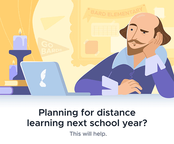
The Challenge In early 2020, schools across the country were scrambling. Some were shifting to distance learning overnight. Others… weren’t planning at all. The client—a leading EdTech provider—had a killer digital platform. What they didn’t have was a way to start the conversation. Enter: a white paper. But not just a white paper. A conversation starter. A light in the fog. A piece that could both educate and generate qualified leads without sounding like a hard sell in a crisis. The Solution The brief was simple: Make schools care. Mike developed a white paper titled “Distance Learning Readiness: What Schools Need to Know (Even If They’re Not Ready to Talk About It)”. It hit the sweet spot: Data-backed: Highlighted research on tech readiness, digital equity, and instructional continuity. Empathetic: Acknowledged how overwhelmed educators were feeling—without piling on. Actionable: Gave district leaders a roadmap to start preparing (and where the client’s product naturally fit in). But a white paper is only as good as the campaign behind it. Mike wrote the entire funnel: Email drip campaign: Thoughtful, low-pressure, and built trust over time. Not a single “act now!” in sight. Landing page copy: Short, sharp, and CTA-driven. Social media snippets: Focused on shareability and signaling leadership. The Results More than $420,000 in qualified new pipeline attributed directly to the campaign Download-to-demo conversion rate: 23% (yes, really) Email open rates: Averaged 41%, clickthroughs over 15% Feedback from Sales: “This gave us exactly the entry point we needed.” “This was the right tone, the right time, and the right way to reach decision-makers. Mike understood both the emotional landscape and the business need. The results speak for themselves.”

The Challenge The client was launching a new tool aimed at remote teams. Sleek UX? Check. Actually solved a real problem? Double check. Now they just needed users. Fast. But the inbox is crowded. And launches are noisy. The client needed copy that didn’t just announce—it needed to ignite. The Strategy Mike wrote a high-converting launch email paired with a minimal, focused landing page. The approach: Lead with curiosity: The email subject line teased value without giving everything away. Talk like a human: The body copy dropped the jargon and spoke directly to remote workers' pain points—with empathy and humor. Keep it stupid simple: The CTA? Just one. “Try it now.” Nothing else. And that landing page? Clean, bold headline, tight benefit bullets, and no distractions. Just signup. The Results 150+ signups in the first two hours CTR: 38% Conversion rate: 46% Internal feedback: “Best response we’ve ever had to a product email.” Client Feedback “Mike nailed the tone. The email felt like it came from us—only better. We got users, buzz, and a huge head start from day one.” The Takeaway When you pair clear, bold messaging with a real understanding of your audience, you don’t have to beg for attention. You earn it.
![The Challenge
The client was hosting a virtual panel on [insert timely industry topic here—e.g., “AI & Compliance” or “Hybrid Work Infrastructure”]. It had everything:
Big-name speakers
Great insights
A clear value prop
What it didn’t have yet? A](https://images.squarespace-cdn.com/content/v1/62eecf28b099531c7e30b141/d8c6e204-c67b-4b62-986c-408c39edca13/Screen+Shot+2022-08-10+at+7.37.52+PM.png)
The Challenge The client was hosting a virtual panel on [insert timely industry topic here—e.g., “AI & Compliance” or “Hybrid Work Infrastructure”]. It had everything: Big-name speakers Great insights A clear value prop What it didn’t have yet? An email that would get people to stop scrolling, click, and actually show up. The Solution Mike wrote a sharp invite email that: Hooked early: The subject line tapped into FOMO without sounding like clickbait Spoke like a real person: No “webinar best practices.” Just, “This is worth an hour of your time, and here’s why.” Used urgency, not pressure: “This is a one-time thing.” (Which was true.) Included a no-BS CTA: “Save your spot”—and done. He also punched up the landing page copy and created a short follow-up reminder series that stayed fun and on brand. The Results 40% open rate (industry average: 15–20%) ~250 attendees, with strong engagement throughout the session 30+ direct demos booked within 72 hours post-event Internal note: “Highest open rate we’ve ever seen” Client Feedback “This campaign didn’t just drive attendance—it drove the right people to show up. Mike understood exactly how to get our message across without sounding like every other invite in their inbox.” The Takeaway Even the best virtual event is dead in the water without copy that cuts through the noise. When your message sounds like it came from a person (not a brand robot), people pay attention—and they show up.

I just really like the Titanic joke

The Goal Start with one webinar. Make it good. Build a series from there. The client wanted to launch a thought leadership series—but wasn’t looking for another bland, bullet-point-filled webinar that disappeared into the Zoom void. They needed to earn that first RSVP. Because without butts in virtual seats, the series wasn’t going anywhere. ✍️ The Approach Mike wrote the invitation email and landing page for Webinar #1. The key was tone: smart, sharp, and just a little unexpected. No fluff: The subject line made a clear promise. Real-world relevance: Framed the content as can’t-miss insight, not a “knowledge download.” A human voice: Less “industry buzzwords,” more “this is actually useful.” Simple CTA: “Save your spot.” No forms. No barriers. Bonus: The email planted the seed that this was just the beginning. 📈 The Results The first webinar drew well over 200 attendees Feedback from Sales: “The quality of leads was 🔥” Sparked demand for follow-ups—Webinar 2 launched within weeks Format + messaging became the template for an ongoing series 💬 Client Feedback “We were hoping for a good first showing. We got a format that we now use across our entire demand gen team. Mike didn’t just write copy—he set the tone for the series.” 🚀 The Takeaway You only get one first impression. When the copy is clear, confident, and real, people don’t just sign up—they come back for more.

April Fool's campaign that let kids oversee what their parents do online.

